
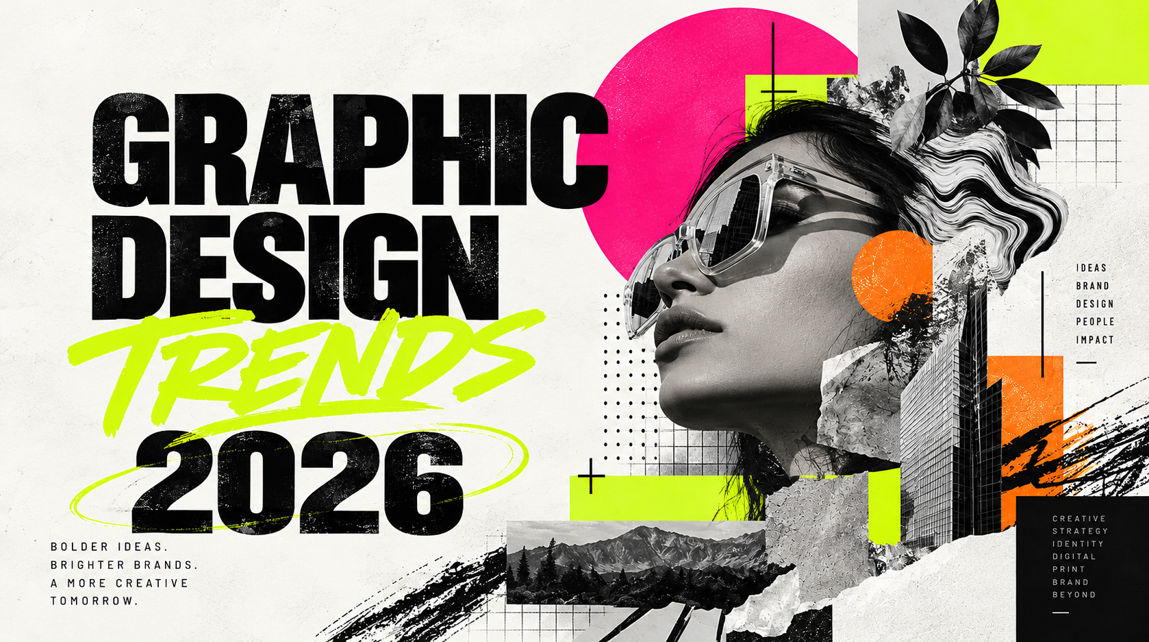
- Imperfect, hand-drawn details help a brand feel real next to polished AI content.
- AI accelerates production — the designer still owns strategy, taste, and storytelling.
- Bold typography and texture turn flat digital design into something you can almost feel.
- Authentic photography of real people and places is becoming a competitive advantage.
- A logo isn't a brand — flexible systems that adapt across every surface are.
I'm Beth, the Creative Director at Punch Creatives. I spend my days in the thick of brand work — sketching logos, pulling Pantone swatches, sitting with clients trying to figure out why their current brand doesn't feel like them anymore. So when I look at where design is heading in 2026, I'm not looking at it from a trends report. I'm looking at it from the desk of a studio that has to deliver real work for real businesses across the South Coast.
Here's the honest truth I keep coming back to: the biggest design trend this year isn't a style. It's a reaction. As AI makes it easier than ever to crank out polished visuals, the brands people actually remember are the ones that feel like a human made them. Personality. Originality. A little bit of mess.
1. Human design is making a comeback
Perfect is starting to feel a little too perfect. I've watched clients look at a flawlessly generated AI layout and say 'it's nice, but it doesn't feel like us.' They're right. The more surrounded we get by polished, computer-clean content, the more a few human touches stand out.
So I'm leaning into hand-drawn elements, imperfect typography, organic shapes, layouts that break slightly on purpose. Not unfinished — intentional. A slightly off-center headline. A brush stroke logo mark. A texture you can almost feel on a business card. Those small choices are what make a brand recognizable in a feed full of sameness.
2. AI becomes a creative tool, not the creative director
I use AI every day in my workflow. It's genuinely useful for brainstorming when I'm stuck, generating variations of a concept, exploring color combinations faster, knocking out repetitive production work. But here's where I draw the line: AI does not own the strategy. It does not own the taste. It does not understand the client the way I do after sitting across the table from them for an hour.
The strongest work I'm seeing this year combines the speed of AI with the judgment of a real creative team. AI gets you to a first draft faster. The designer makes the call on what's actually right for the brand. That's the balance, and it's working.
3. Bold typography takes center stage
Typography is doing a lot of heavy lifting right now. I'm pulling oversized headlines, condensed typefaces, dramatic scale shifts, unexpected font pairings into nearly every brand I touch. Type has become a visual element in itself, not just a way to deliver a message.
The trick is balance. Pair a bold, expressive display font with a clean, highly readable body font. Let the headline grab attention and let the body copy do its job. Done right, you get design that's impossible to scroll past without sacrificing clarity — which matters more than ever when half your audience is on a phone.
4. Texture brings digital design to life
I've always loved texture — probably because Punch does a lot of print and apparel, so I'm constantly thinking about how a design feels in your hand, not just on a screen. This year, that tactile sensibility is showing up in digital work everywhere.
Paper grain, fabric, glass, paint strokes, metallic finishes, dimensional shadows. These are adding warmth and depth to websites, social content, and packaging. It's a deliberate contrast to the smooth, too-clean look of computer-generated imagery. When a digital design has texture, it feels like it was made by someone who cares — because it was.
5. Minimalism gets more personality
Minimalism isn't going anywhere, but it's not the cold, empty white-space version anymore. The minimalism I'm building now has one or two strong visual elements surrounded by breathing room — an oversized type treatment, an unexpected color, a striking photograph, a bold graphic shape.
It's still clean and confident, but it has something to say. I'd rather see a layout with one bold choice and a lot of space than ten safe ones crammed together. Less, but with intention.
6. Authentic photography wins
People have gotten remarkably good at spotting imagery that feels staged, generic, or generated. Stock photos of models shaking hands in a bright office don't convince anyone anymore. What does work is authentic photography — real people, real environments, genuine moments.
For the businesses I work with across Massachusetts and Rhode Island, professional photography and video are worth their weight in gold. You're showing something a competitor literally cannot duplicate: your actual team, your actual shop, your actual work. Authenticity is becoming the competitive advantage, and a camera in the right hands is one of the best brand investments you can make.
7. Motion becomes part of brand identity
A brand isn't experienced just through a business card or a brochure anymore. It moves. Animated logos, kinetic typography, scroll effects, micro-animations, short-form video — these are extensions of visual identity now, not afterthoughts.
When I build a brand system, I'm thinking about how the logo animates on a website, how a transition feels in a social post, how a type treatment behaves in a video. A brand that feels alive across motion gets remembered. A static one gets scrolled past.
8. Unexpected layouts break the grid
Perfectly symmetrical, predictable layouts are giving way to more editorial, experimental compositions. Overlapping images, off-center type, unusual cropping, layered elements. It creates movement. It makes you want to stay on the page.
But — and this is important — it only works when there's still a clear visual hierarchy guiding you. Breaking the grid is a choice. Breaking the message is a mistake. I'll push a layout as far as it can go, and then I pull it back to where it still communicates clearly. That's the craft.
9. Local and cultural influence gets stronger
This one is close to my heart. The South Coast has a visual identity — the mills, the waterfront, the neighborhoods, the lettering on old storefronts. When I pull from where a business actually is, the brand feels like it belongs. A Fall River restaurant brand should feel different from a Newport one, and both should feel different from a generic national chain.
Regional architecture, local landscapes, cultural references, the typography you see walking down a main street — these give a brand a sense of place. For local and regional businesses, that connection with the community is worth more than any trend.
10. Brand systems become more flexible
A logo alone isn't a brand. I've been saying that for years, and in 2026 it's more true than ever. A successful identity has to work across a website, Instagram, a video, a t-shirt, a storefront sign, packaging, and a digital ad — sometimes all in the same week.
So I build flexible systems: multiple logo configurations, supporting graphics, a photography style, a type system, motion guidelines, color palettes, recognizable visual elements. Consistency still matters, but flexibility matters just as much. The brand has to hold together whether it's on a phone or on a building.
The biggest trend in 2026? Be recognizable.
Trends give us inspiration, but chasing every trend isn't the answer. The strongest brands know who they are. Whether your visual identity is minimal, bold, sophisticated, playful, or a little unconventional, good design should make your business recognizable before someone even reads your name.
Technology will keep changing. Platforms will keep changing. Design trends will keep changing. A strong brand should be built to evolve with them — not locked into a look that ages the second the next thing comes along.
That's how I approach every brand I touch at Punch. We combine strategy, creativity, and technology to build brands that don't just look good. They connect with the right people and help a business grow. And because Punch is part of Punch Club, we can take that brand all the way through — from a logo on a screen to embroidery on a hat to a sign on a storefront — without it losing its identity along the way.
Ready to give your brand a fresh perspective? Punch Creatives builds brand identities for businesses across Massachusetts and Rhode Island — design that looks like you, feels like you, and stands apart. Let's talk about what yours could be.